A hell of a phase! Much labor of love, dealing with numerous technical challenges, redesigning an entirely different architecture, API, and here we go! We made all pre-planned sections of the app offline accessible! We didn’t cheat, didn’t take any shortcuts, and stayed committed. Now we are really proud of ourselves.
In this post, I’ll briefly cover the problem we faced before Beta 12, our solution to overcome it, and its implementation during beta 12. I also discuss the reasons behind why we accepted the challenge in the first place.
Audio Version – Read by Author
Spotify
Video version is available on author’s instagram: @yaashaar_com
Beta 11 and 12’s Philosophy
Beta 11 and 12 were all about changing the beneath architecture of our platform for long-term benefits. But why did we even bother?

The Problem
The iOS seizes any communication to servers from an app that has been pushed to the background (e.g., when you switch apps). They claim it is there for the privacy of iPhone users, and there are some truths to it. It would ensure that no app can monitor and report your activities while you’re on another app. This measurement also greatly helps iOS free up resources such as RAM or CPU, all to save your phone’s battery.

Apple puts some exceptions for VoIP apps like WhatsApp, Google Due, streaming services, etc. However, to qualify, you have to brand your app in these categories, and still, there are some technical limitations. I’m not digging into it as this is not a detailed technical post.
Such architecture limits apps that require maintaining a live connection between their clients and their servers. They need to establish a new one every time a user brings the app back to the foreground and prune idle connections.
These procedures are complicated and most of the time unreliable. Moreover, they also introduce a notable delay for users to interact with apps that only serve users when they have Internet access.
The Solution
There were some workarounds that we investigated. They were poorly documented and were mostly proved to be unreliable in our internal testing. So we decided to eat the frog! That is, making the app features that heavily used live connections offline accessible. It would let users keep interacting with the app even after they lost connection (e.g. switching between their apps) or went offline. In offline supported features, they would no longer need to wait for a (new) connection to be established and everything would synchronize as soon as they went back online.

We knew from the beginning that it wouldn’t be an easy solution to implement and would require a lot of fundamental changes in the platform’s architecture. We also knew it would be something way bigger than our relatively small-sized team. However, we couldn’t ignore how it would drastically improve the user experience and all other benefits it would bring us down the road. That is how we ended up starting this long phase of reconstruction.
The Implementation
Making features offline accessible was a lot of work. We were constantly facing new challenges and were trying different engineering ideas that we could come up with to overcome them.
Some attempts were successful, and some just yielded a myriad of new problems. Then we had to resolve them by either reversing our steps to try a different idea or by dealing with new subsequent issues in case those solutions were worth it.

Besides, we altered the way client requests and changes are being compiled and transmitted to our servers. Subsequently, we modified how associated responses are created on the backend side and how they are received and processed on the client side.
Everything would be much easier if we didn’t have existing user data. We had warned our testing users before enrolling them into our beta testing program of the possibility of not keeping their data in these pre-release beta phases ( because of these types of possible scenarios that we have to change the entire architecture), yet, we decided to try our best. We took it as a drill to prep ourselves for possible similar circumstances in the future. Fortunately, we carried it out successfully and managed to keep all existing user data intact.

On the surface layer, we didn’t much change the user interface. But, we have massively optimized the user experience. The app acts as a standalone unit now. That is, the user can interact with it as soon as they open it. They no longer need to wait for the server’s response. In a nutshell, it’s way more responsive and speedy now.
The Journey in Retrospect
Beta 11 and Beta 12 took us a good six months.

They were tough and taxing. Redesigning the entire platform’s architecture was the greatest challenge I’ve ever taken during all the years I’m developing software applications.
We were understaffed to the extent that we divided the long Beta 12 into four separate quarters to avoid burning out. We were running out of budget, but we had to finish what we had started to be eligible to access the next installment of the share capital we raised a few months ago.

Was making these features offline accessible worth the time, effort, and resources we allocated during these months? We are inclined to believe it was. Let me briefly cover our most notable reasons behind this decision:
Scalability
Instead of releasing more and more features to attract investors, we chose to address a soon to be realized scalability issue that most apps in the same category will have to deal with it as soon as they start drawing some traffic: serving requests efficiently.

For instance, to process the requests that we could, on the client-side to avoid putting unnecessary load on the servers. This way, the infrastructure could serve more users.
Competitive User Experience
Most startups choose to release more super-beta features in this stage. They do not necessarily have a long-term plan for each. But we truly believe that we have only a few chances and a short amount of time to make a remarkable first impression on a new user of the platform. We have to persuade them that this is a world-class app that can help them solve a real-world problem.

If features and the overall user experience of the platform were not on par with the competition or at least close to it, we would lose our shot. It was unrealistic to expect a user in 2021, wait for a few seconds until the app gets connected to the servers every time they switch to other apps and come back.
Best Use of Time
I’ve mentioned frequently in my updates during the last year and a half that we were hit hard by the COVID-19 pandemic. The use case of many features in our app was directly impacted by restrictions people/governments put in place to prevent people from spreading the variants of the Coronavirus.
While the situation had started to get better (thanks to the global vaccination), we found it far from being optimal or semi-optimal to take any serious steps towards launching the app for the public.

We thought then It would be a good use of time to address the concerns I described above, instead of waiting for something that was, and still is, obviously out of our hands.
Timeline
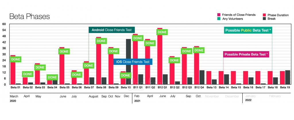
I guess it’s no surprise to anyone who has followed my updates at this point to learn that Beta 11 and especially Beta 12 messed with our planning a lot. So, we made some adjustments. This is how the latest version of the project timeline looks like, albeit it’s subjected to many other possible future amendments as we move forward:

Public Beta Testing
We had been supposed to hold an evaluation meeting back in July in the company. But, as you learned in my last update, we had put it off until Beta 12 was finished. Although we haven’t confirmed its time yet, we probably will hold it right after coming back from the break.
One of the main agendas of this meeting would be deciding when to start the public beta testing. I’ll update you on this then.
Well, that’s about it.
Until the next update, Stay safe!
Cheers!

